Guide
The Personalization Guide
How to get a result you will still love in ten years
Most disappointing keepsakes are not badly made. They are badly briefed — a photograph that was never going to work, or a name that was one character too long. Here is how to avoid both.
Choosing the photograph
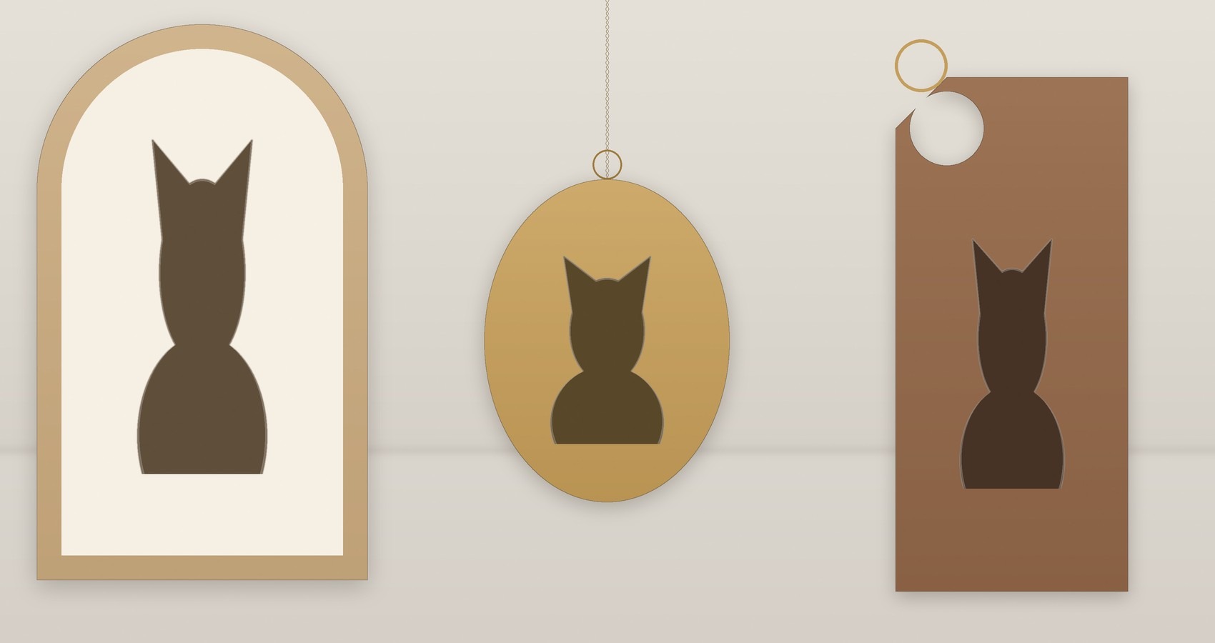
- Front-on or full profile
- Anything between is hardest to read as a silhouette. A three-quarter view loses the ear shape.
- One animal
- Two heads in one outline reads as a smudge at small sizes. For two pets, choose a piece with two separate panels.
- Plain background
- A busy background is fine for the photo we work from, but a plain one needs less redrawing and gets to the bench faster.
- Eyes visible
- If we cannot see the eyes clearly, the profile will read as generic. Send another.
- At least 800 px on the short side
- Bigger is better. Anything under 800 px and we will ask you to resend.
Wording
Shorter is better, every time. A single name engraved large will be legible in thirty years; three lines of dates and endearments will be a grey band.
If you are unsure, send us what you want to say and we will tell you what will fit. We do this a hundred times a week.
Choosing a finish
Timber
Oak is the safe choice and the lightest. Walnut is warmer and shows the engraving more strongly. Blackened ash is the most graphic.
Metal
Brass patinates and darkens. Sterling silver stays bright but scratches. Vermeil is the best of both if you will actually wear it.
Stone
Basalt and slate read best for engraving. Marble is beautiful and the hardest to photograph — trust the preview.
You approve the artwork
You approve the artwork
Nothing is cut until you have seen a rendered preview and said yes. If it is not right, tell us what to change and we will render it again — there is no limit on revisions.